Zoja
- Year
- 2026
- Client
- Zoja
- Scope
- Branding, Custom typography, Illustrations
- Publication
- Women's fitness platform • Strength, confidence, zero gym bro energy
About the project
Most fitness brands tell you to work harder.
Zoja takes a different approach. Built by two incredibly driven founders, the platform creates a space where women can feel stronger, more confident and genuinely excited to train—whether they're picking up weights for the first time or the hundredth.
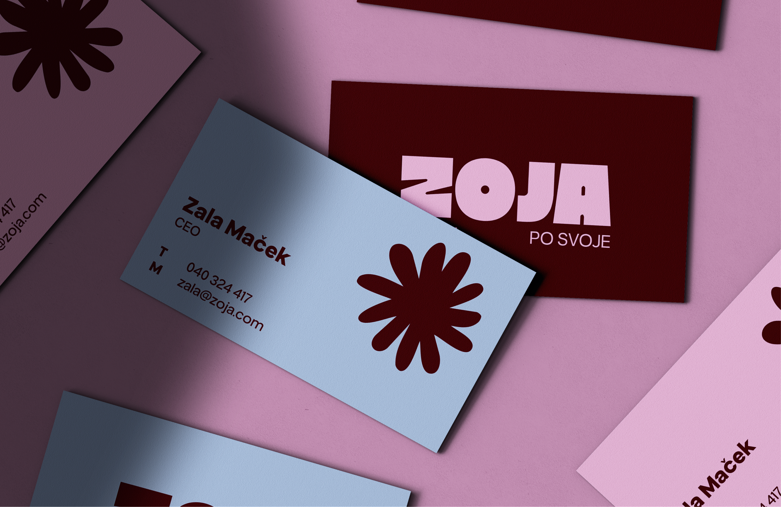
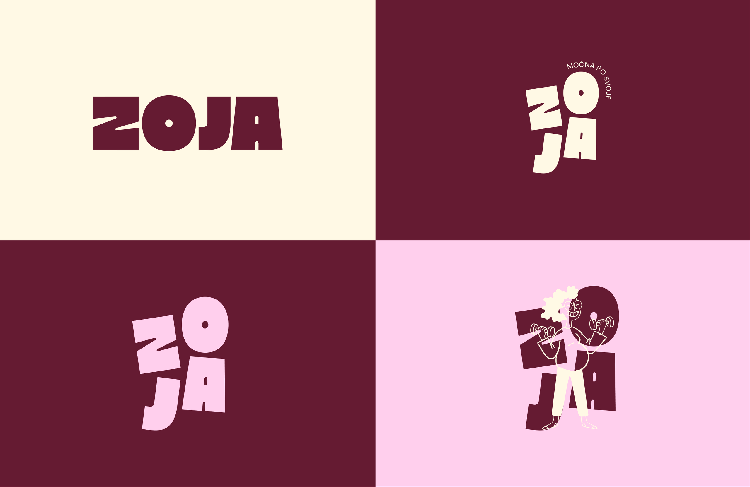
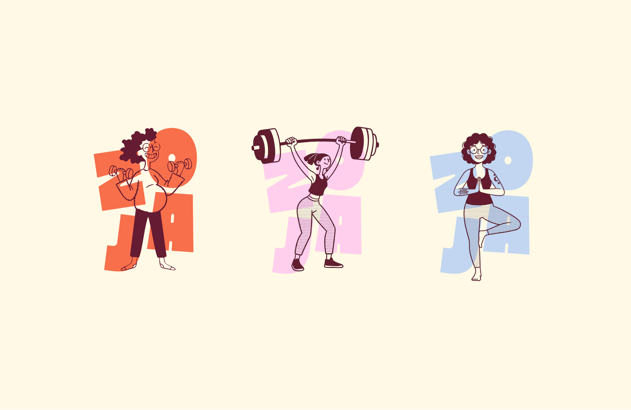
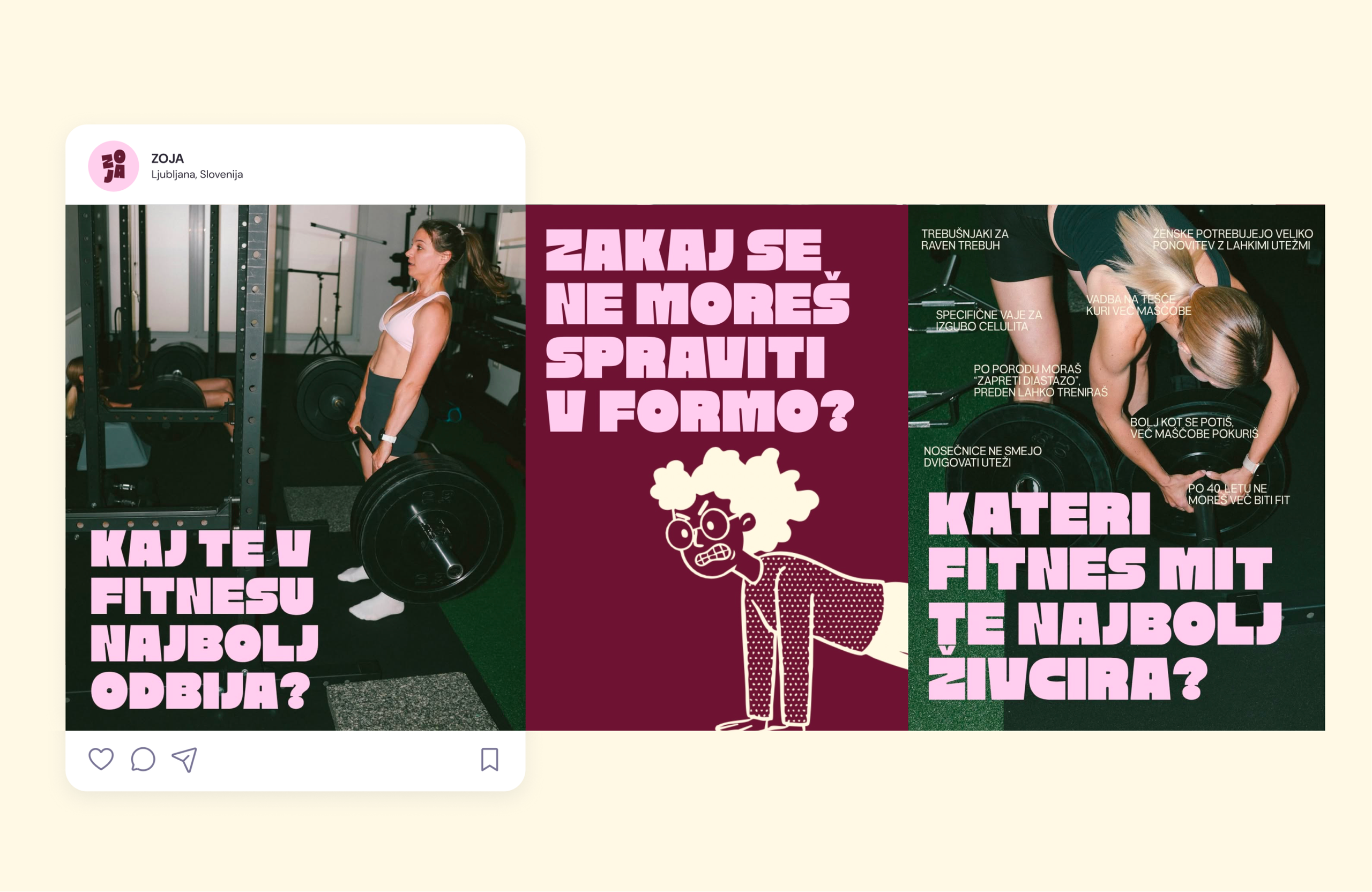
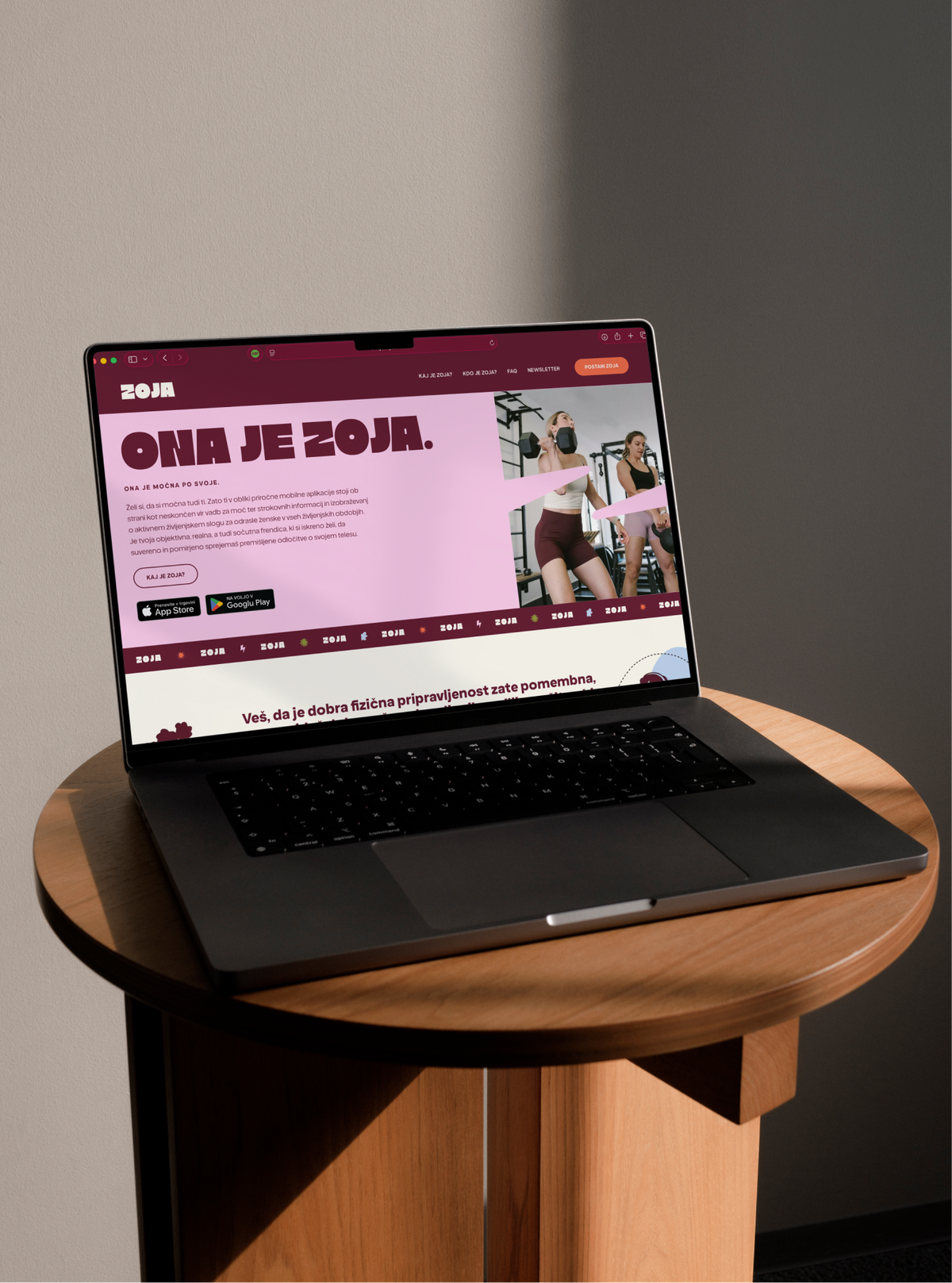
I created the complete visual identity, including branding, custom typography and a playful illustration system that feels energetic, approachable and full of personality. The goal wasn't to make fitness feel intimidating—it was to make it feel like something you actually want to come back to.
And yes... they also convinced me to stop avoiding the dumbbells. Turns out I had nothing to be scared of. 💪
Fun fact
Zoja finally got me to stop being scared of the weights section. Turns out lifting heavy is actually pretty fun.