Zase in zate
- Year
- 2024
- Client
- Scope
- Book design, Editorial design, Illustrations, Art direction
- Publication
- Poetry • Read from both sides
About the project
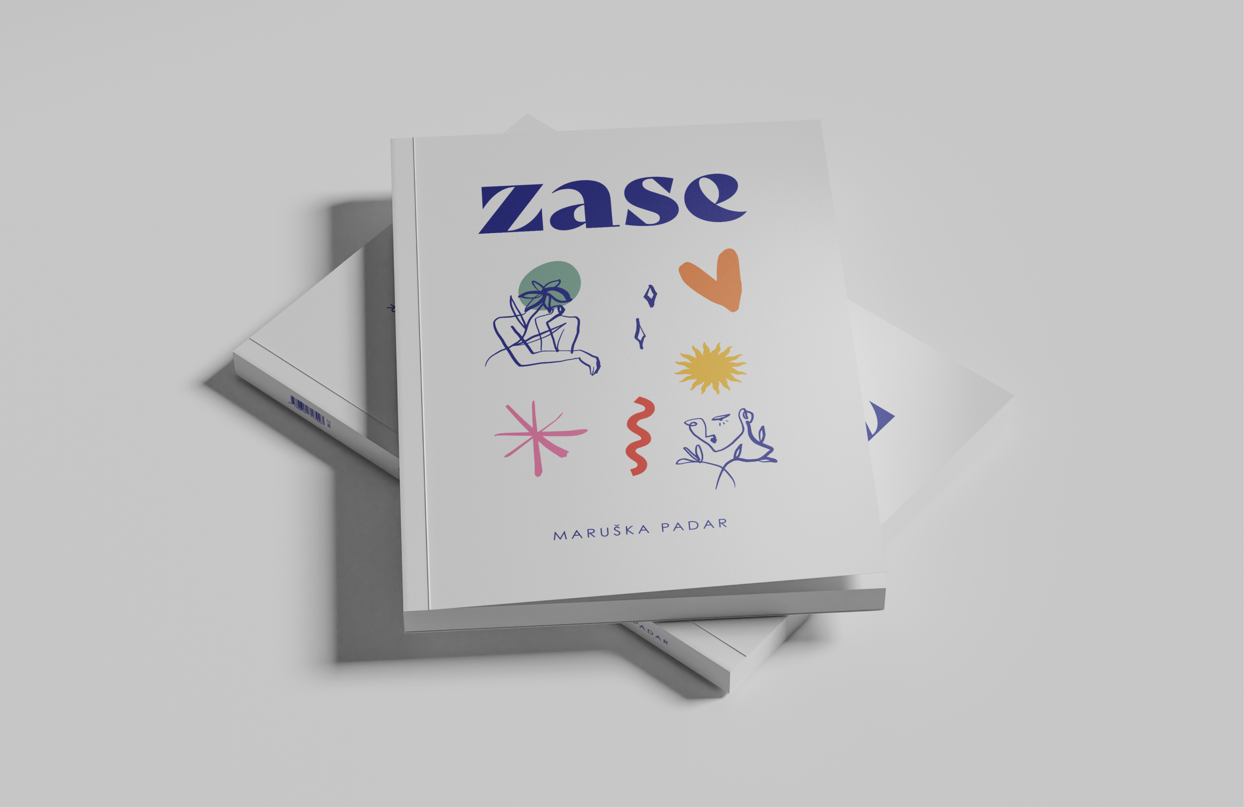
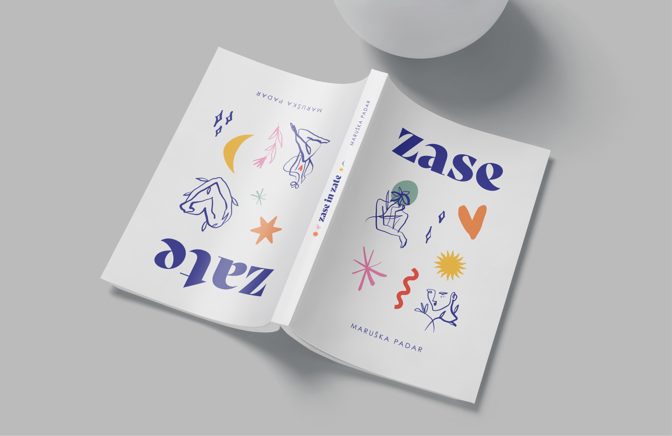
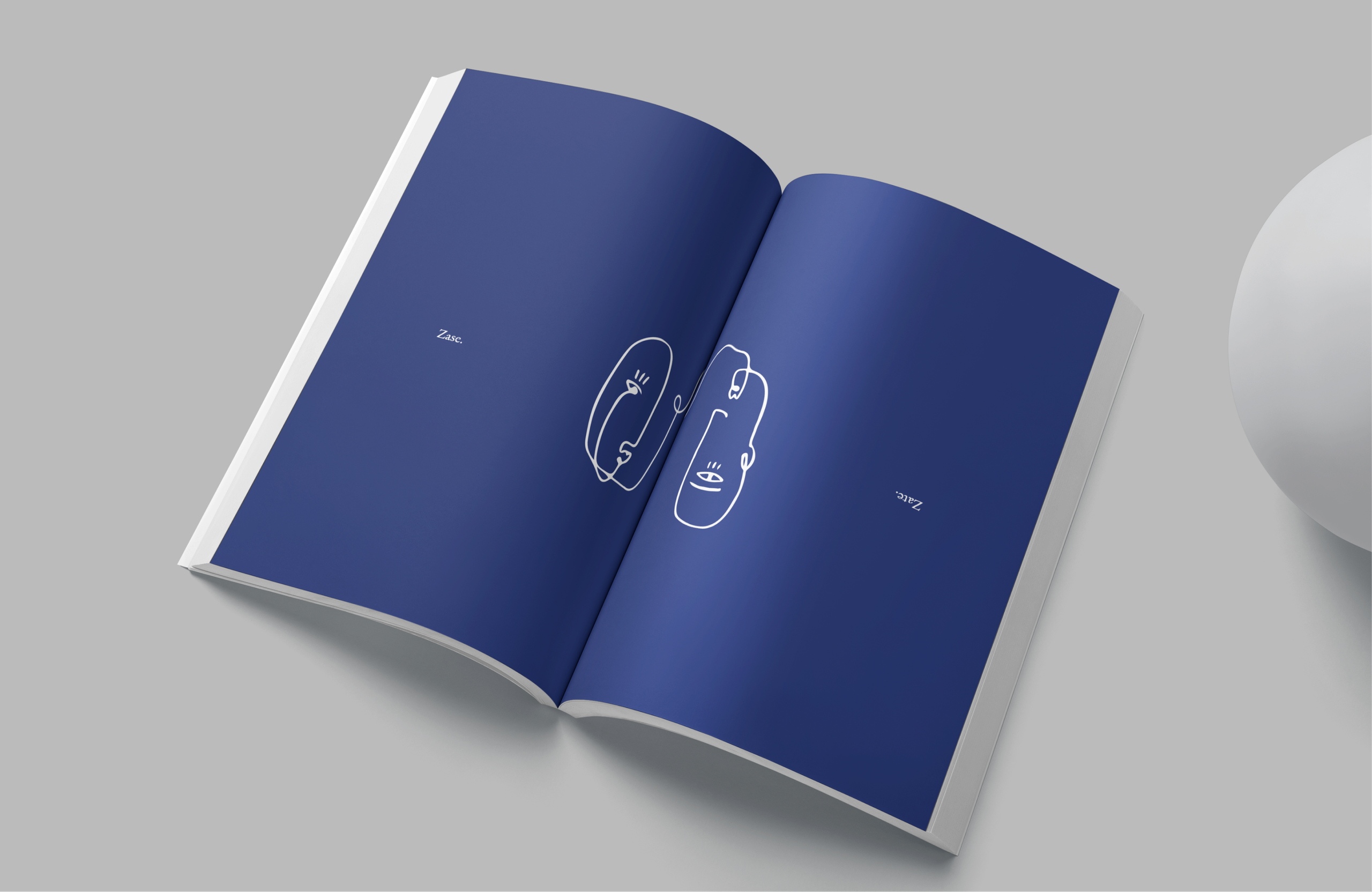
A poetry book that's read from both sides, meeting somewhere in the middle. Just like the poems themselves.
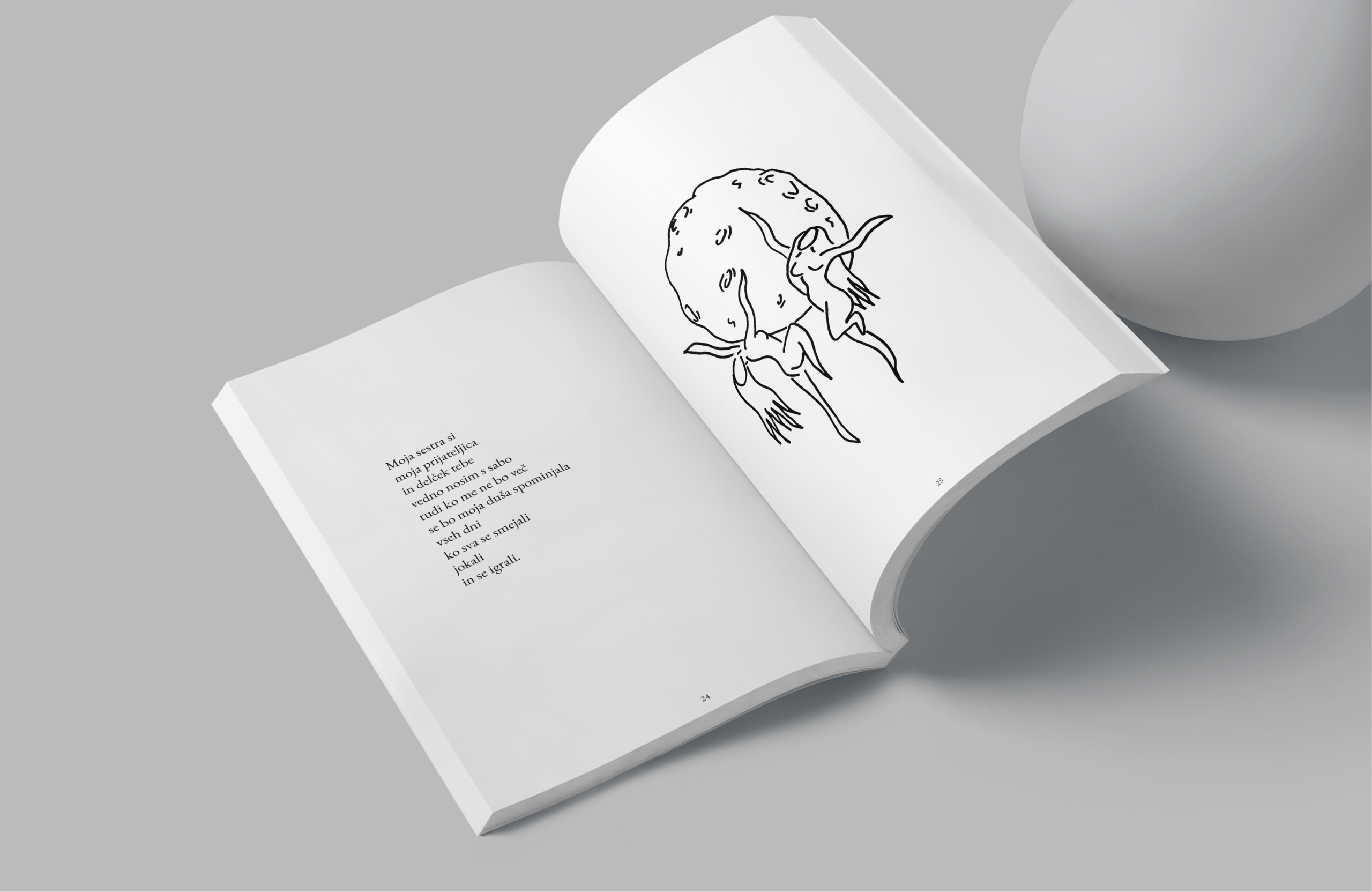
I designed the entire visual identity of the book—from the layout and typography to a series of hand-drawn illustrations that quietly live between the verses. The goal wasn't to compete with the poetry, but to give it room to breathe.
Working on this project slowed me down in the best possible way. Somewhere between laying out pages and reading the same poems over and over, they started reading me back.
Still one of the projects that's closest to my heart.
Fun fact
I made this during a pretty rough chapter of my life. Turns out spending months with poetry is surprisingly therapeutic.