Studio Limona
- Year
- Client
- Studio Limona
- Scope
- Branding, Custom typography, Illustration
- Publication
- Pottery studio • Handmade letters, organic shapes, a little creative mess
About the project
Some things are better when they're a little imperfect.
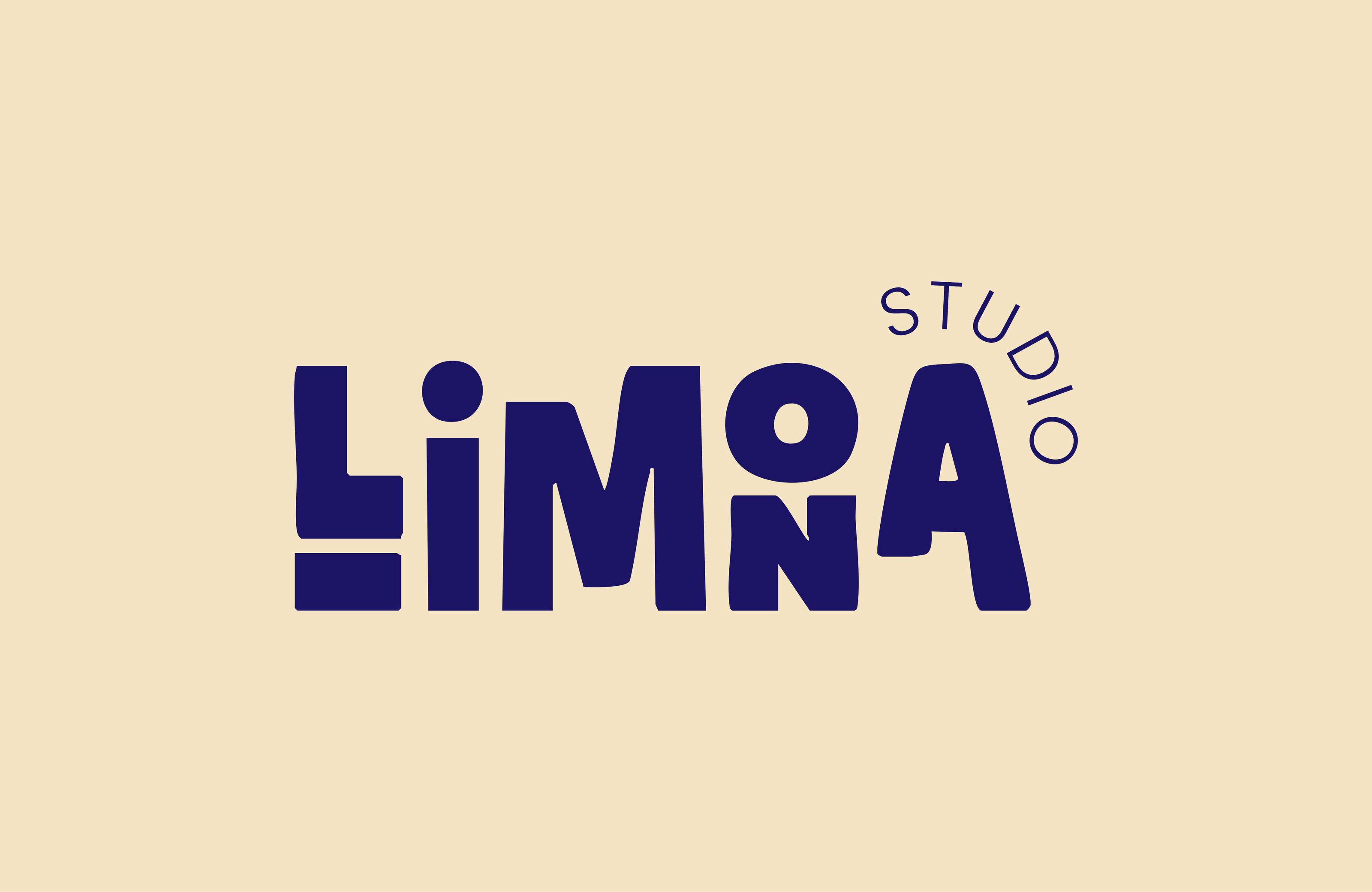
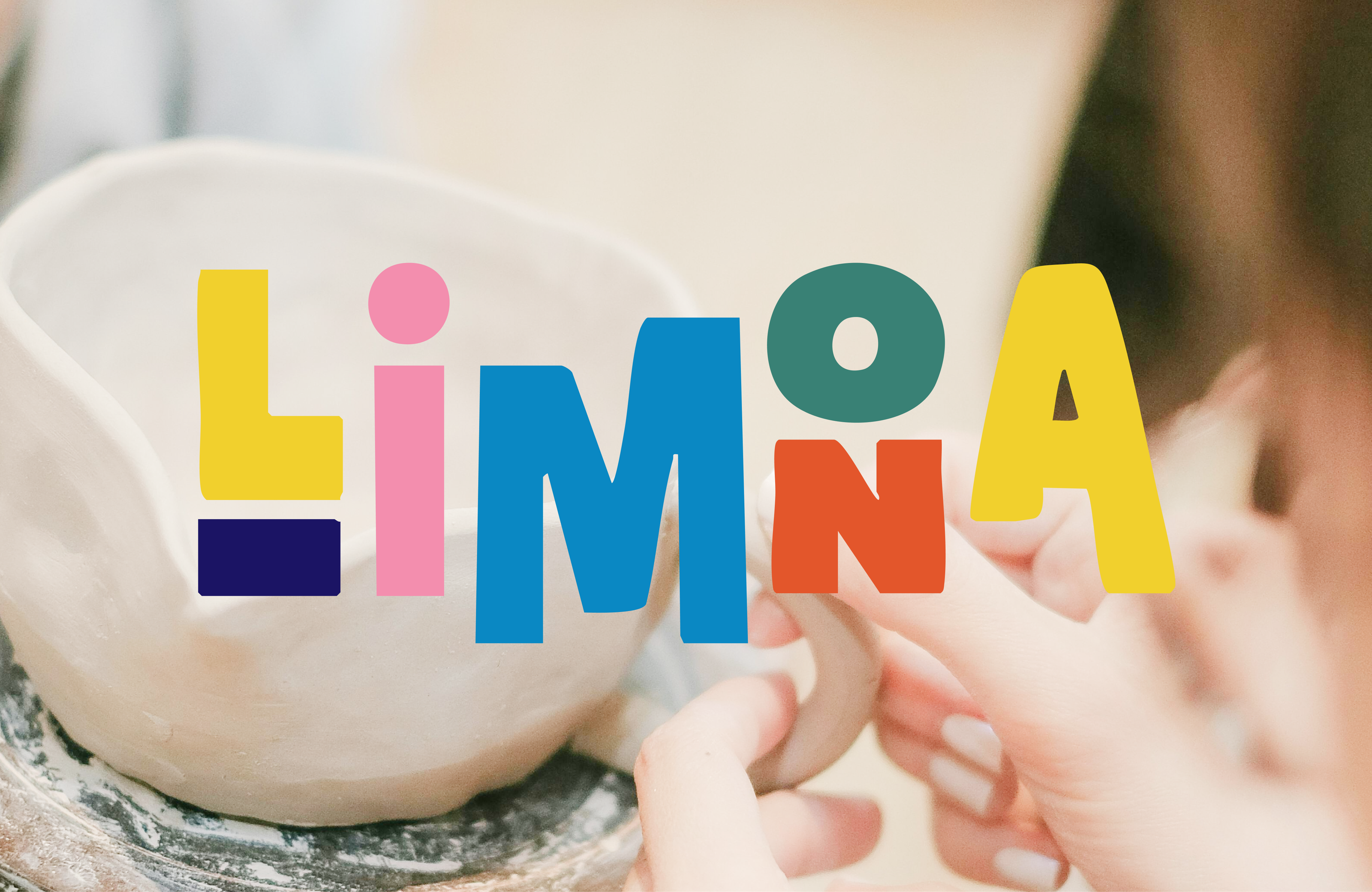
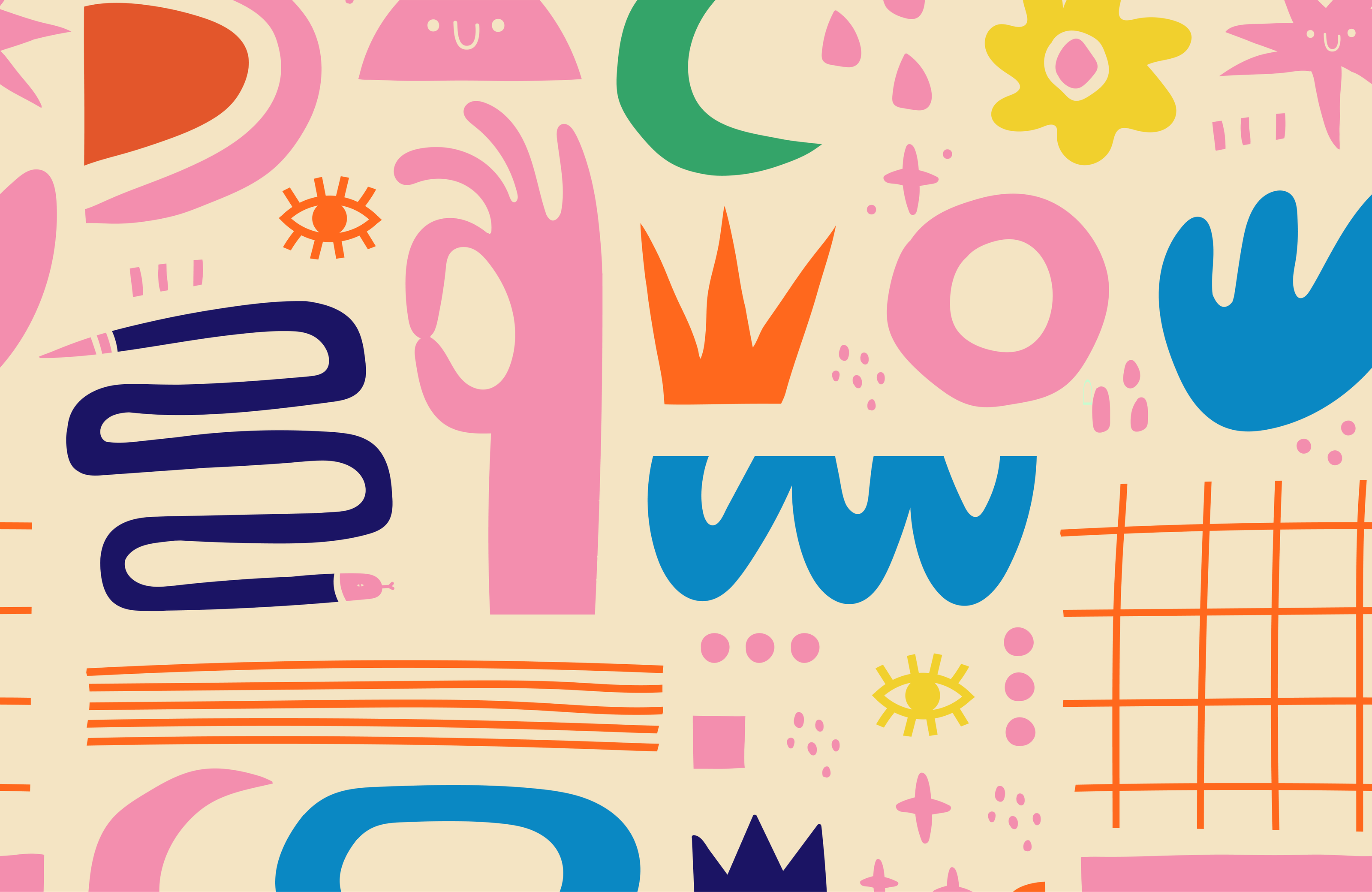
Studio Limona is a pottery studio built around the beauty of making things by hand. I wanted the branding to feel just as personal and imperfect as the ceramics themselves.
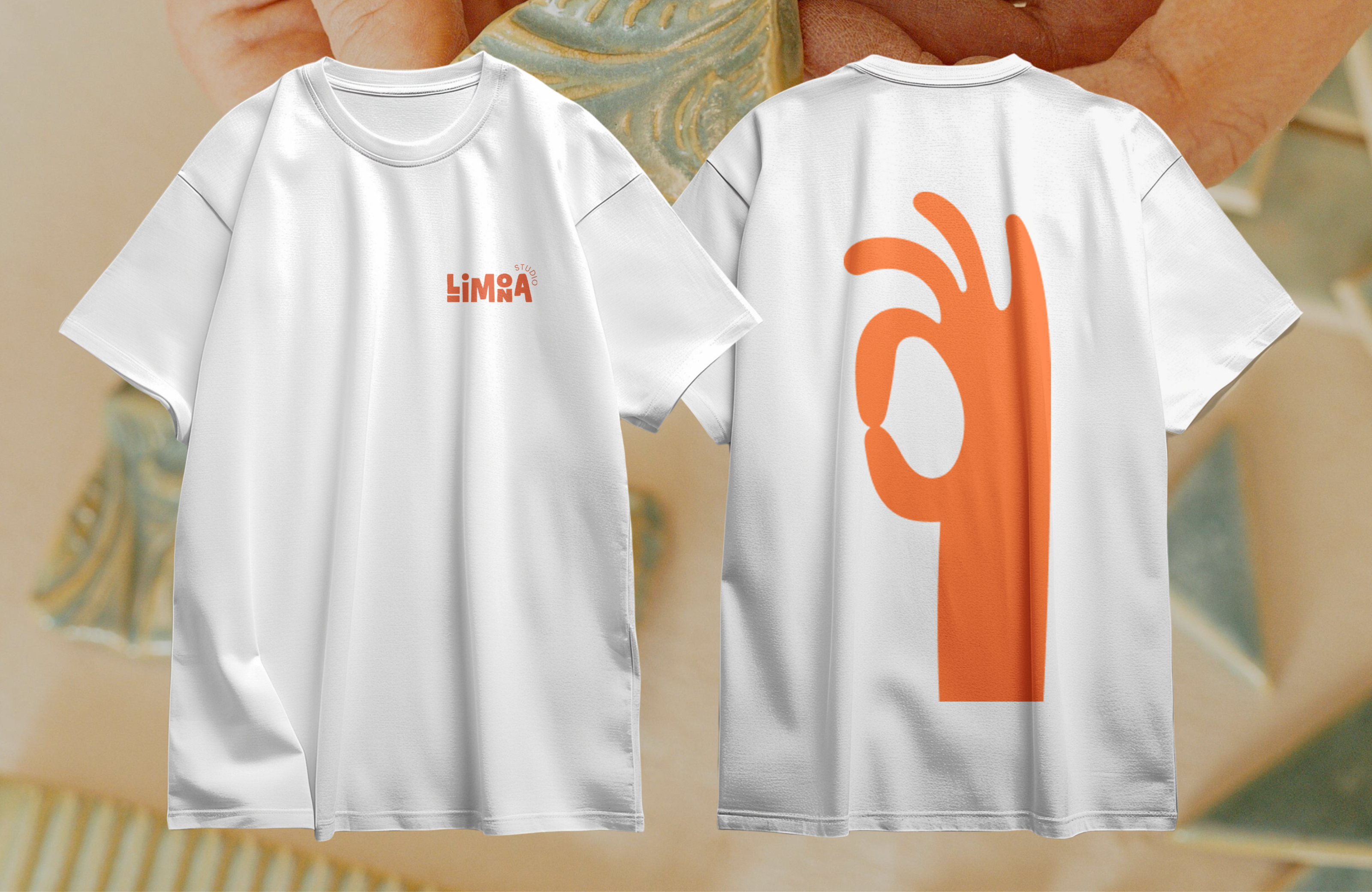
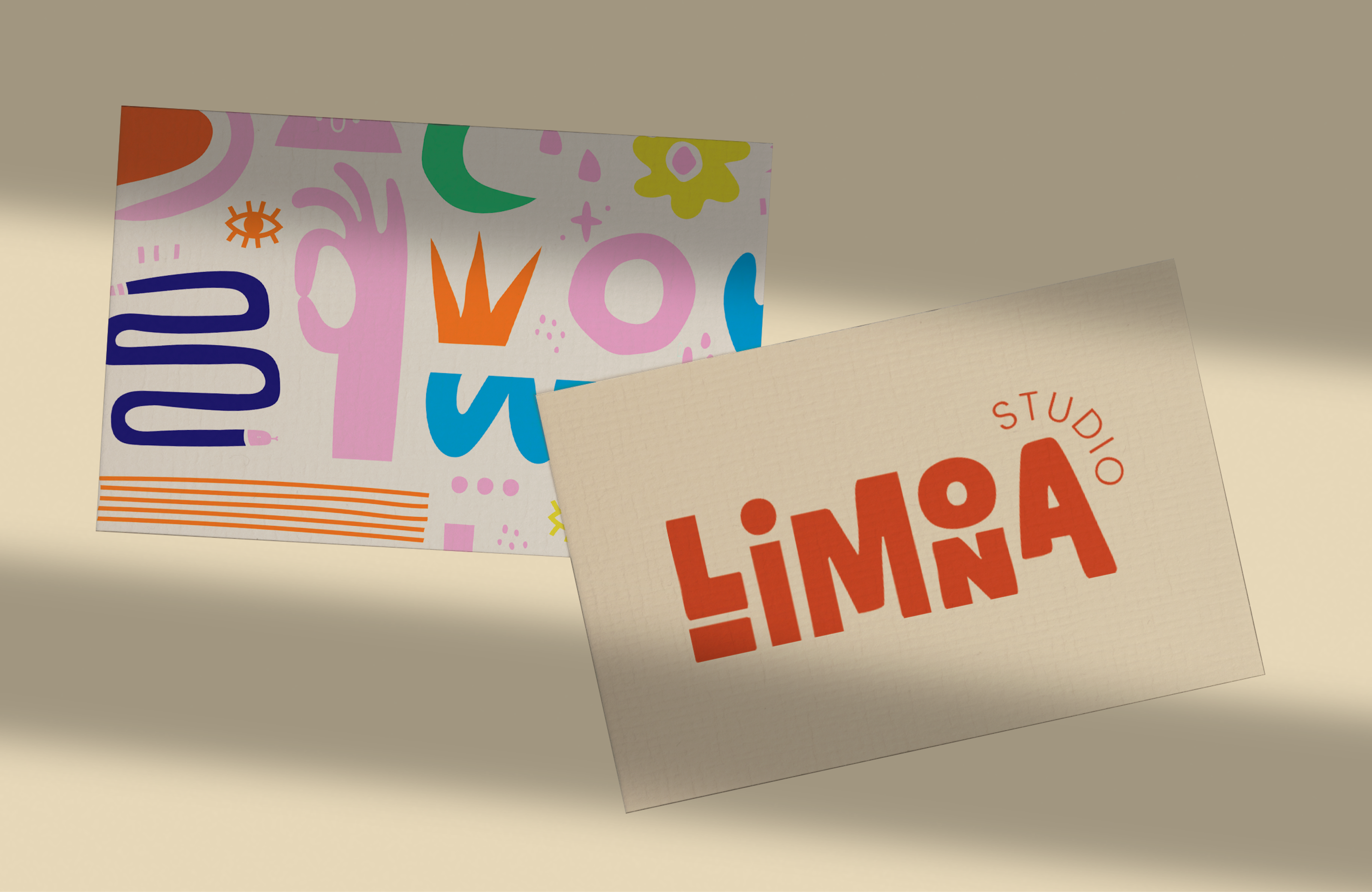
I created a visual identity centred around handmade typography and organic illustrations, with playful shapes and little imperfections that give the brand its character. Nothing too polished, nothing too serious. Just a warm, expressive identity that feels like it was made by actual hands.
Because perfectly straight lines are overrated anyway.
Fun fact
Turns out designing letters and making pottery have a lot in common. Both look easier than they actually are.