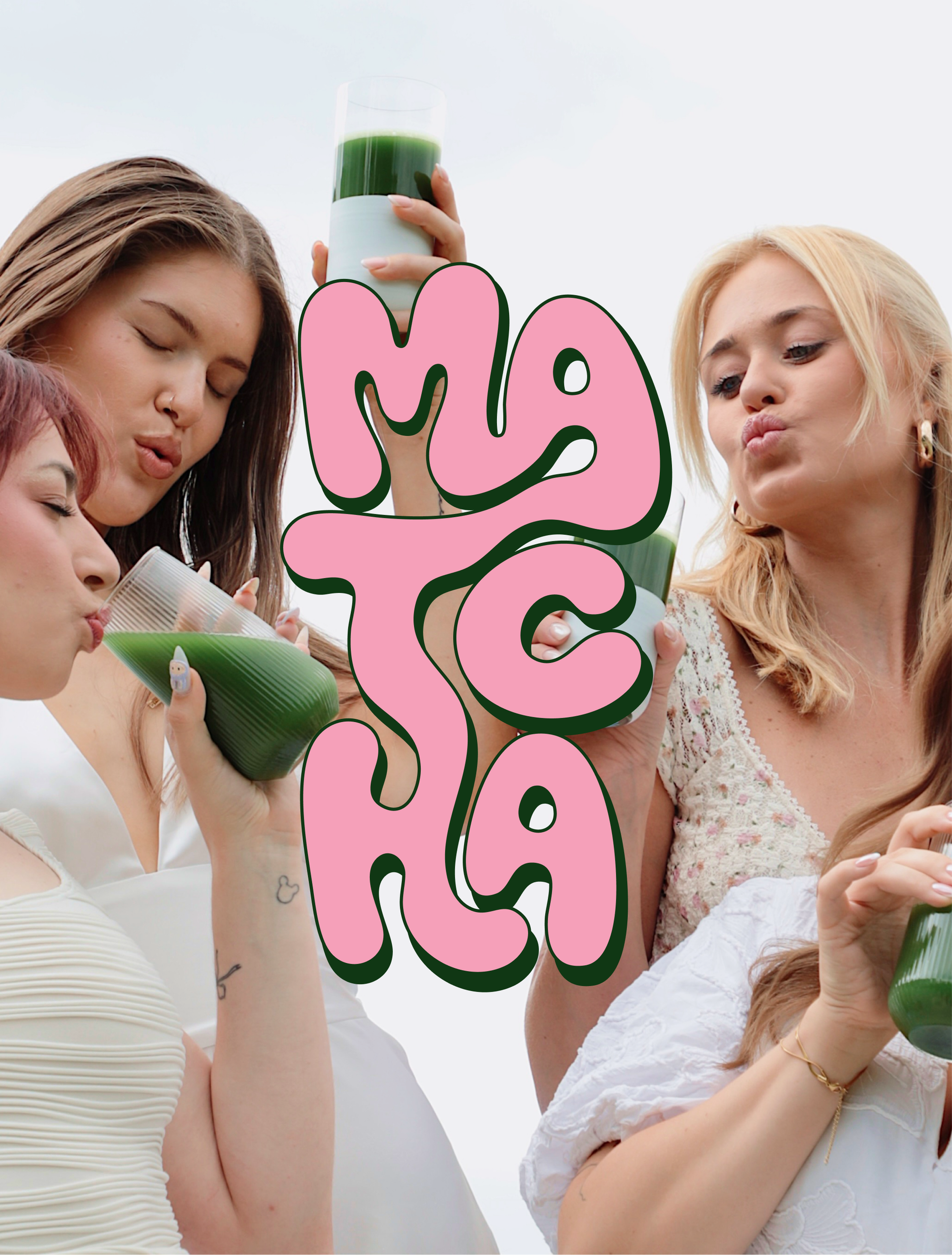
Pop Matcha
- Year
- 2026
- Client
- Pop Matcha
- Scope
- Branding, Packaging
- Publication
- Matcha • Bold colours, loud typography, a little caffeine-fuelled chaos
About the project
Somehow, matcha became the official drink of people with perfectly colour-coordinated lives.
Pop Matcha is for everyone else.
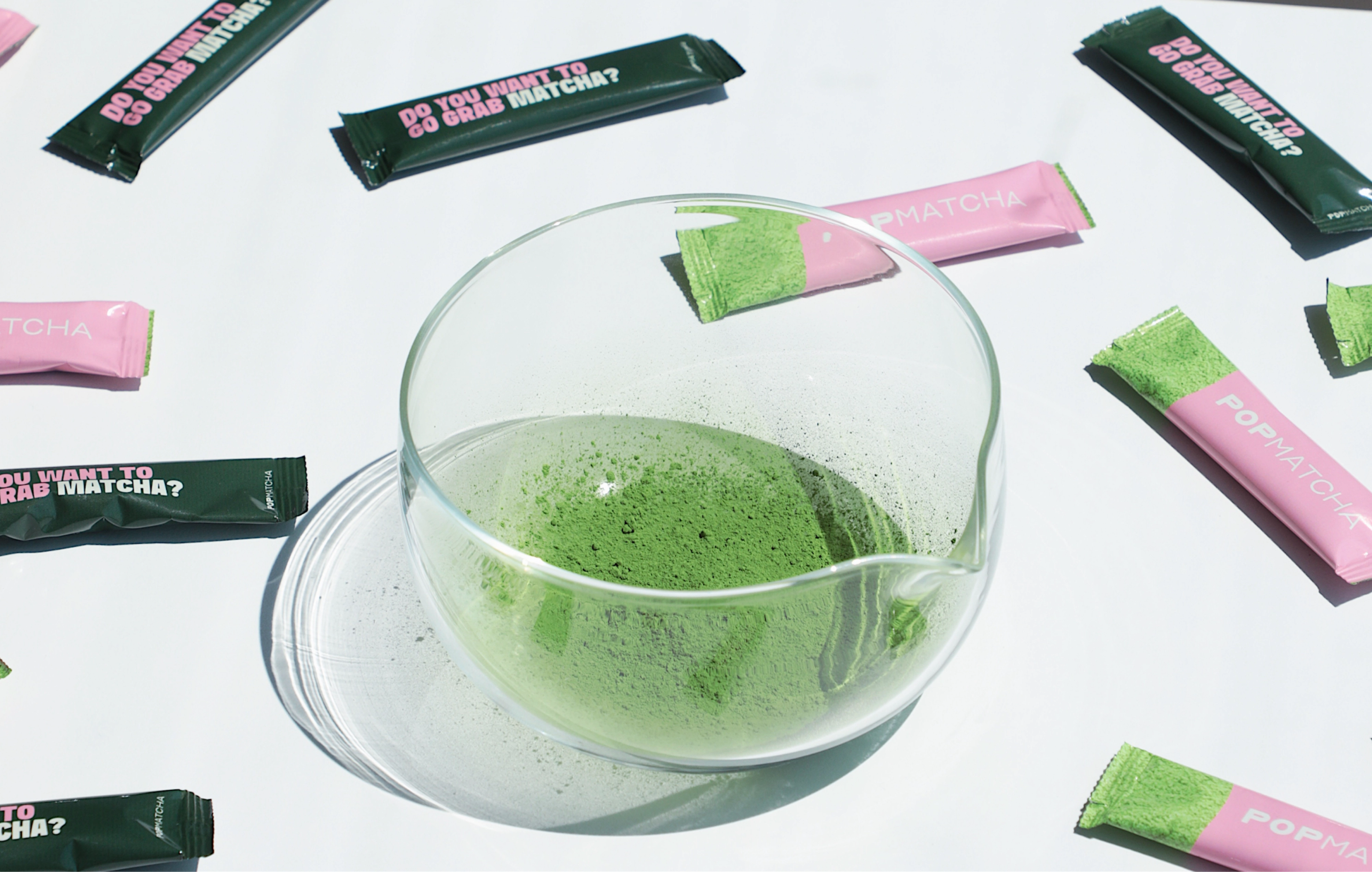
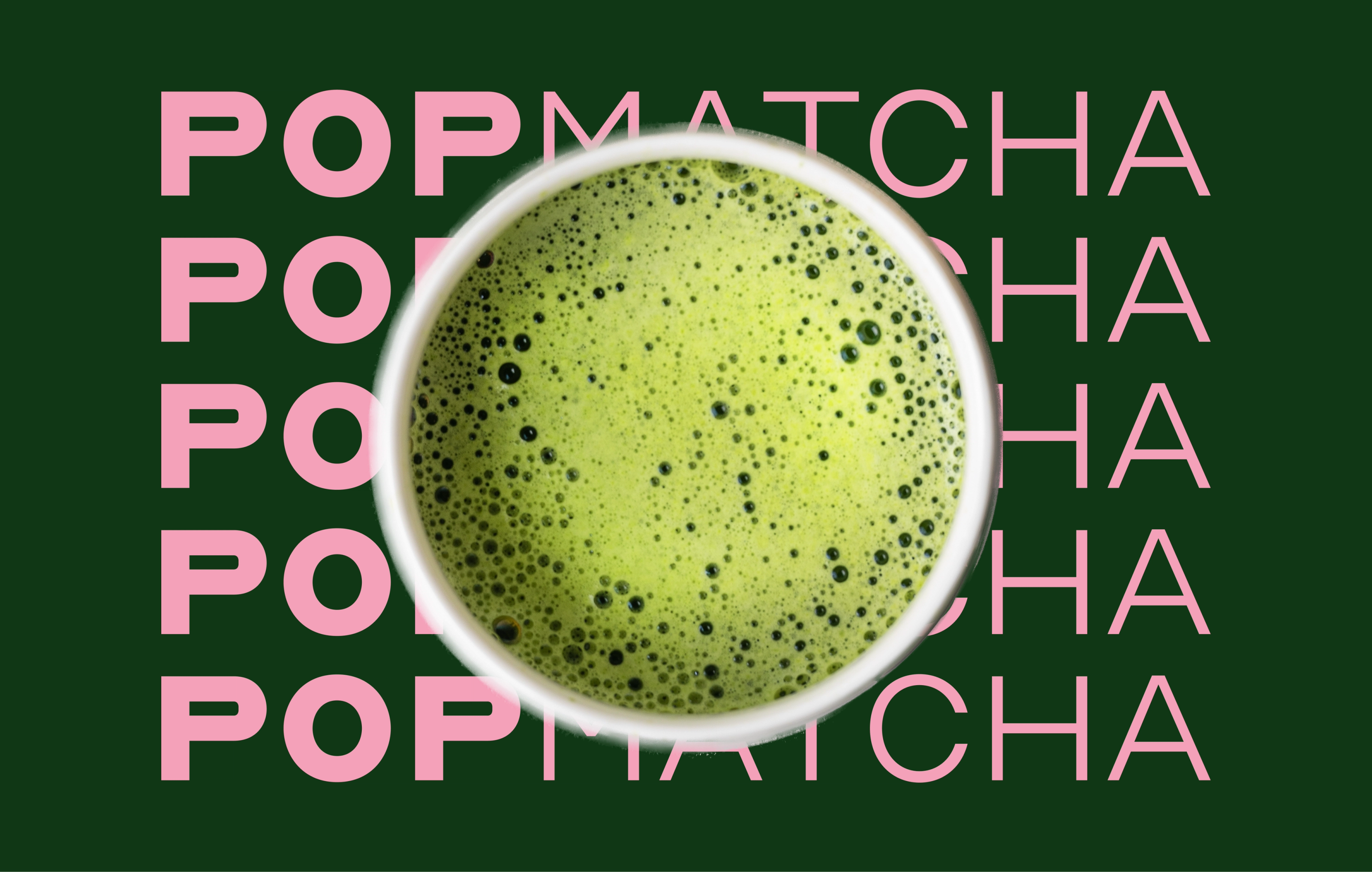
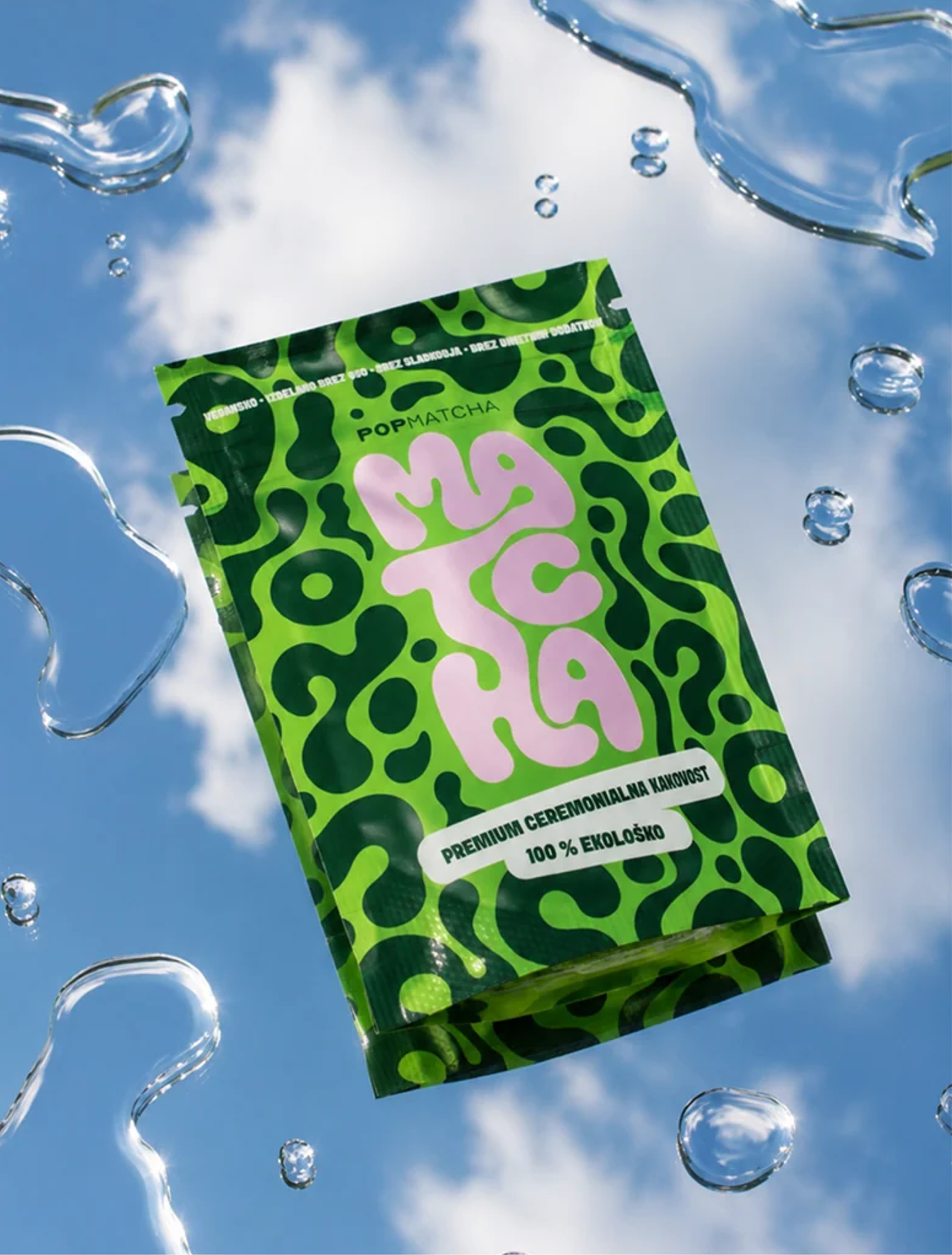
The idea was to create a brand that doesn't take itself too seriously—a bold, playful identity that feels more like grabbing a matcha after a cigarette than after a 6 a.m. wellness routine. Bright colours, expressive typography and unapologetically loud packaging turn something usually associated with perfection into something a little more real.
Because you can love matcha...
...and still be a little chaotic.
Fun fact
Not everyone who drinks matcha goes to Pilates five times a week. Some of us are just trying our best.