
Mokosh
- Year
- Client
- Mokosh
- Scope
- Branding, Visual identity
- Publication
- Fashion concept store • Natural textures, minimalism, a little mythology
About the project
Some brands don't need to be loud to make an impression.
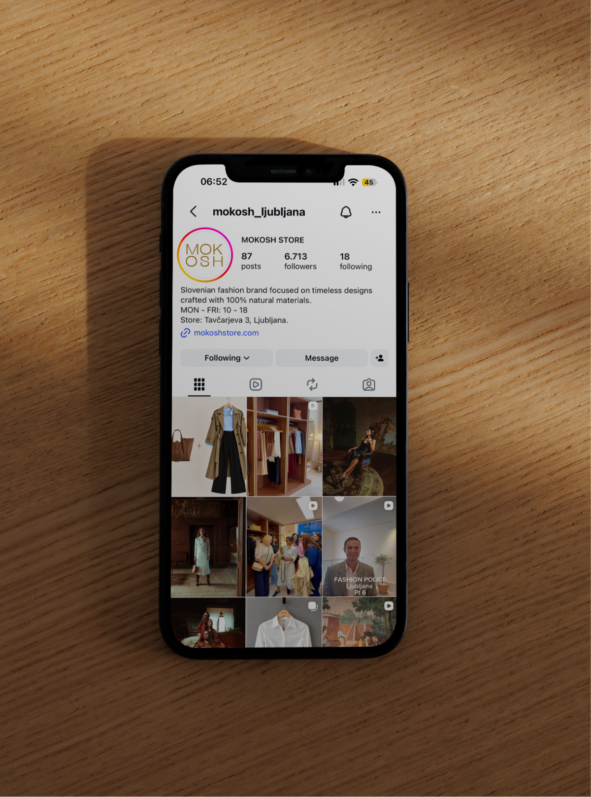
Mokosh is a fashion store named after the Slavic goddess of weaving, celebrating natural materials, timeless pieces and the beauty of simplicity.
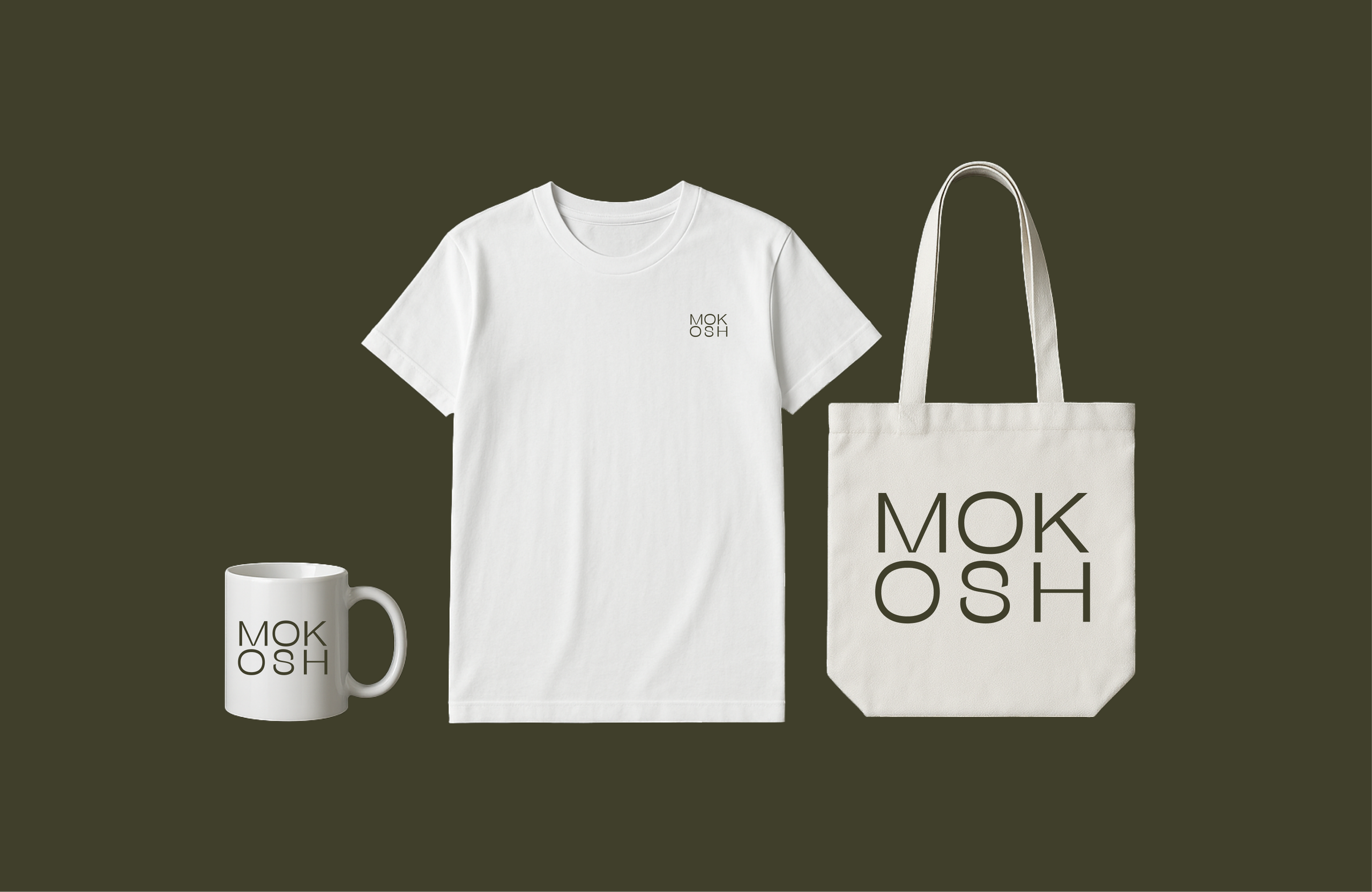
I wanted the branding to reflect exactly that. A minimal, understated visual identity inspired by nature, craftsmanship and the quiet elegance of the clothes themselves. Nothing unnecessary, nothing trying too hard. Just thoughtful design that lets the products speak for themselves.
Because sometimes the most beautiful thing you can do is leave things alone.
Fun fact
The two owners are absolute icons. And somehow, their clothes are just as beautiful as they are.