
Insane
- Year
- 2026
- Client
- 4KidsAndUs
- Scope
- Branding, Packaging, Art direction
- Publication
- Gen Z natural cosmetics • Bold colours, loud typography, one squeeze of chaos
About the project
Natural cosmetics don't have to look... natural.
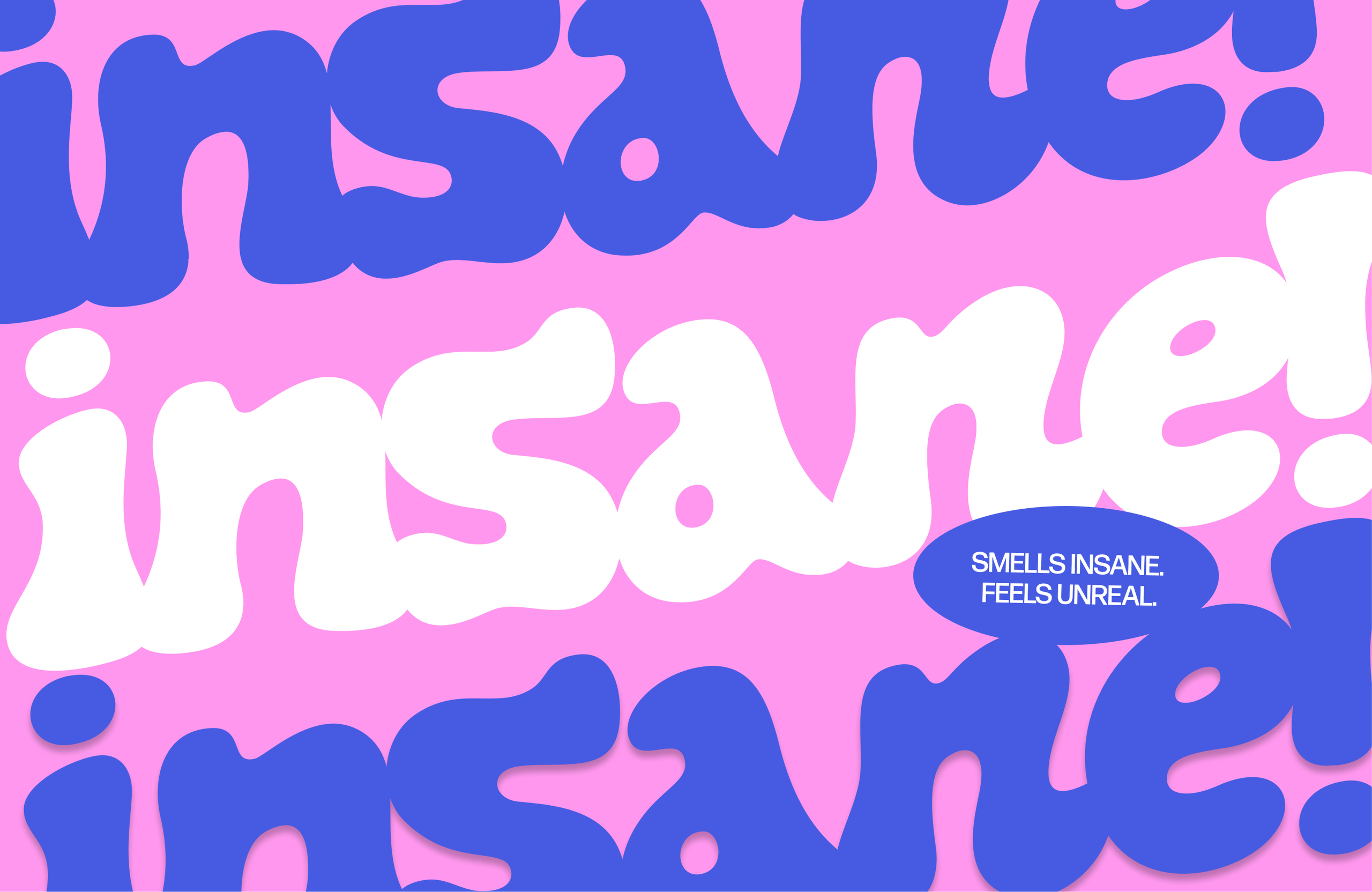
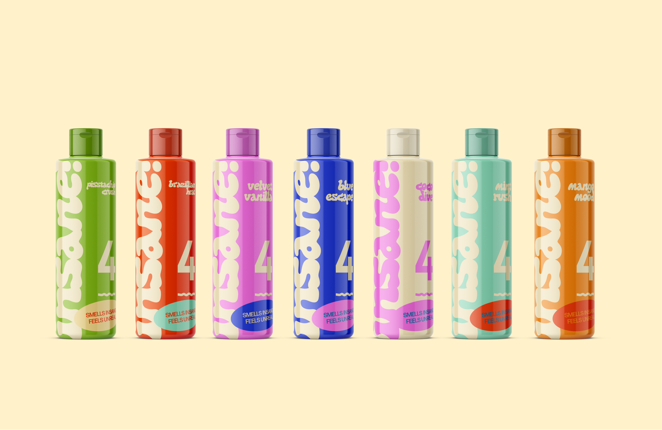
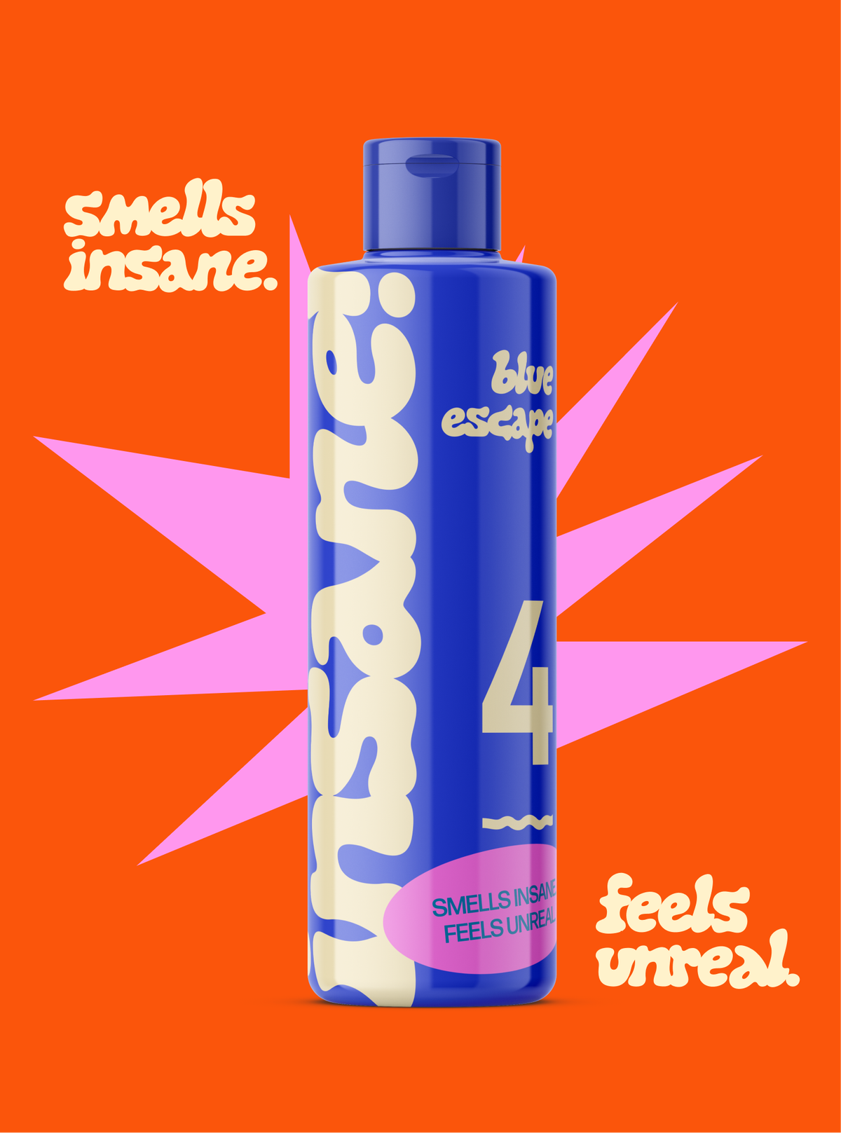
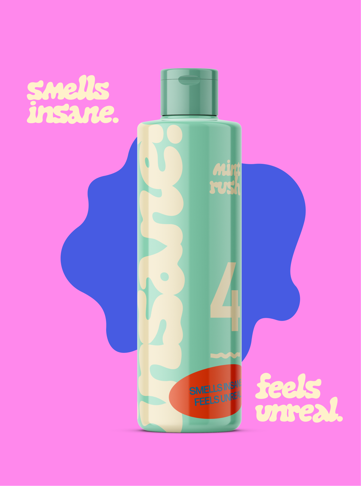
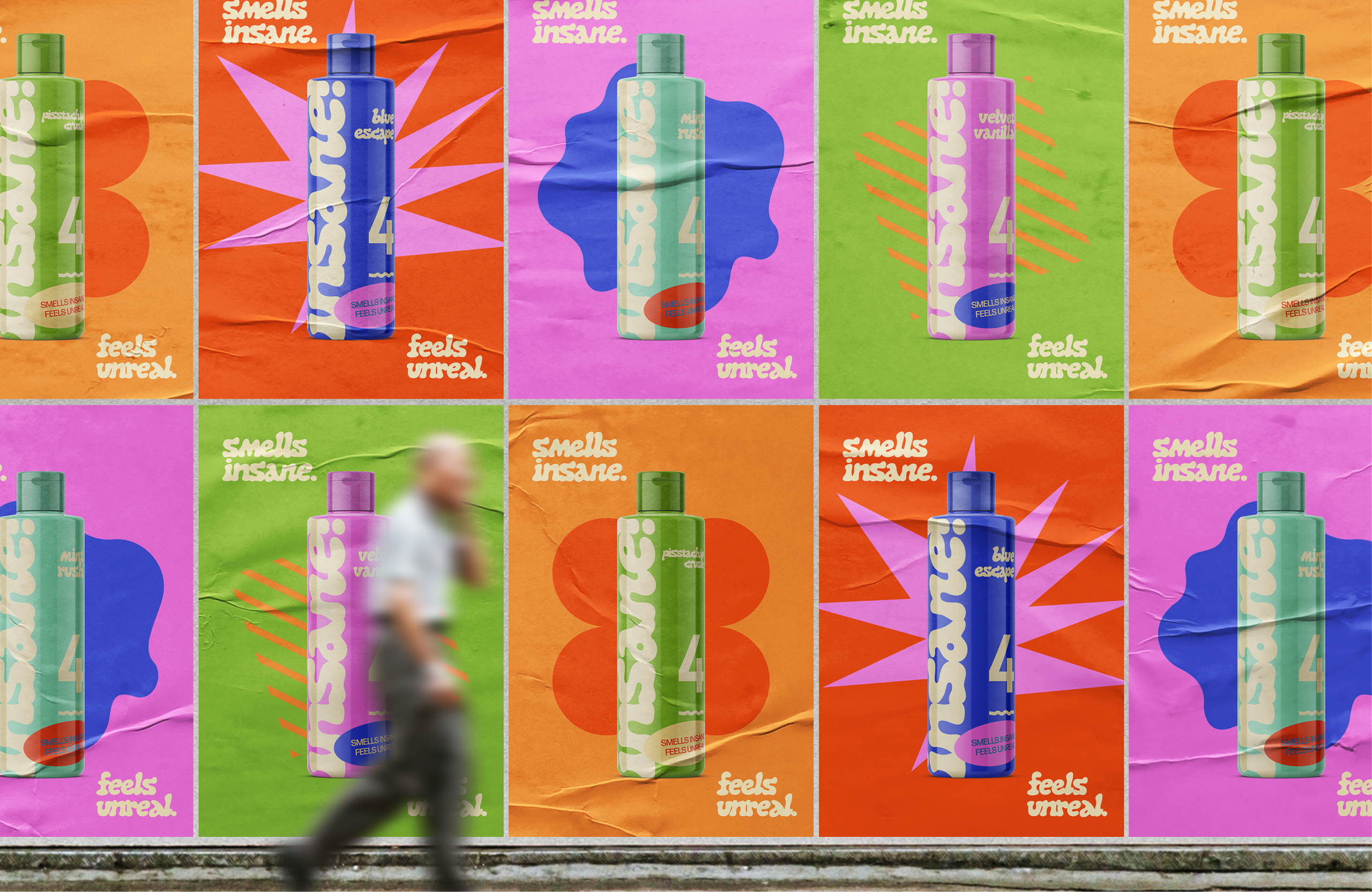
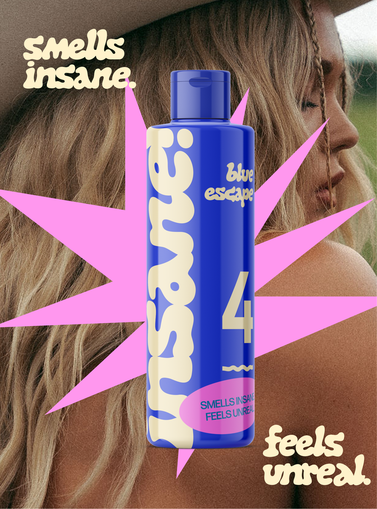
Insane is a Gen Z sub-brand of 4KidsAndUs, created to bring personality back to everyday haircare. Instead of the usual muted palettes and botanical clichés, I leaned into something much louder—bright colours, oversized typography and packaging that wouldn't look out of place next to ketchup or your favourite sauce.
I developed the branding, packaging and overall art direction, creating a visual identity that's playful, bold and impossible to ignore. The result feels less like something you'd hide on a bathroom shelf and more like a product you'd proudly leave out.
Who says shampoo can't have main character energy?
Fun fact
I wanted the bottles to look more like hot sauce than shampoo.